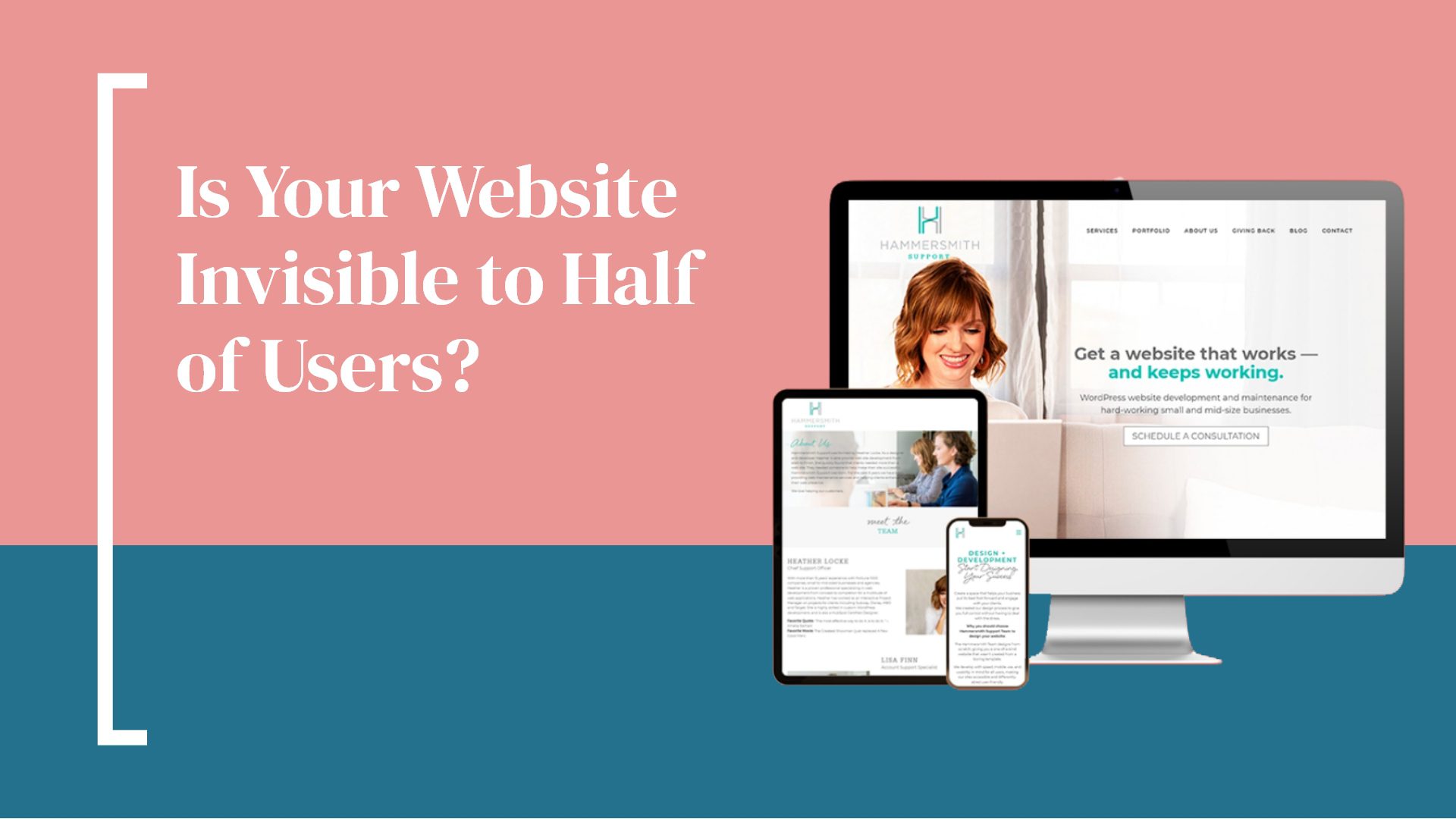
You read that right – your website could be invisible to nearly half of the users you’re trying to attract. How could that be? If your site is not mobile optimized, vital sections of your site may not be visible to users. Potentially even worse, the information could be jumbled or may not be sized correctly for mobile devices. This can contribute to a higher bounce rate and loss of potential traffic. Don’t worry! There are solutions to ensure that your site is visible to everyone, no matter what kind of device they are using to access your site.
Mobile Optimization
Mobile-first design means that a website is built from the mobile view first, then the desktop. This is an important concept because it means that the site will always be ready for mobile users. It’s estimated that 75% of the world’s Internet users will do so exclusively from a mobile device by 2025, according to CNBC. Building your site with that in mind is a pretty good idea.
Check and Recheck
One of the easiest ways to check to make sure your site is visible on a mobile device is to simply go to your site from a mobile device! It seems silly, but many times business owners are accessing their site via desktop only, and never confirming how it looks from a mobile device.
In addition, some platforms require manual changes to a page for mobile viewing. For example, Wix does not automatically translate a page’s layout to a mobile version. Elements may be sorted differently or may be too large to view on mobile. Be sure to not only check the mobile preview section but also from an actual mobile device as well.
It’s Good for SEO, Too
Google began considering mobile-first design as one of the ranking factors when evaluating a site. These factors play a key role in search engine return pages – where your site ranks in a query. In addition, mobile optimization is considered to be part of website accessibility and it’s important that all users are able to access your website.
Hammersmith Support Can Help
Wondering if your site is mobile-optimized? Or are you thinking it might need some help? Hammersmith Support has you covered. Schedule a complimentary 30-minute meeting and let’s talk through your questions and about how Hammersmith Support can help you and your business.

