This week we are kicking off our Website Best Practices series! We’ve broken down each best practice into a four-part series of posts so that we can dig deeper into each step. While each best practice is quite simple, they are extremely important and powerful when applied together. Over the next four posts, we’ll explore (1) messaging, (2) calls to action, (3) functionality, and (4) security. Up first: messaging.
What Is Website Messaging?
Put simply, your website messaging is the basic explanation of what your business does. Donald Miller of StoryBrand explains that your website messaging must be able to pass the grunt test. Meaning your messaging should be so clear, a caveman could answer these three questions with a grunt:
- What do you offer?
- How will it make my life better?
- How do I get it?
What Should Be Included?
While this concept of messaging is simple, it’s not always easy to achieve. Two of the ways that your site messaging can be crystal clear is by being concise with your descriptions. Don’t use acronyms, industry jargon, or any other not commonly understood phrases. The risk when using those items is that potential customers walk away because they don’t think your product or service is for them.
Next, your site messaging should have clear calls to action. These are buttons that a site visitor clicks to take the next step. That step may be setting up a meeting, sending an email inquiry, or going to a survey page. CTA’s are the next phase in the process, but if the visitor can’t find it or doesn’t understand the process, they’re likely to bounce.
How Can You Improve Messaging?
Not all messaging relies on words. Everyone absorbs information in various ways, which is why images and icons are useful in clear messaging. While an image doesn’t have to be of your exact business, it should be representative of your business. In addition, icons can be used to visually break up information but also convey a message.
Examples of Great Messaging
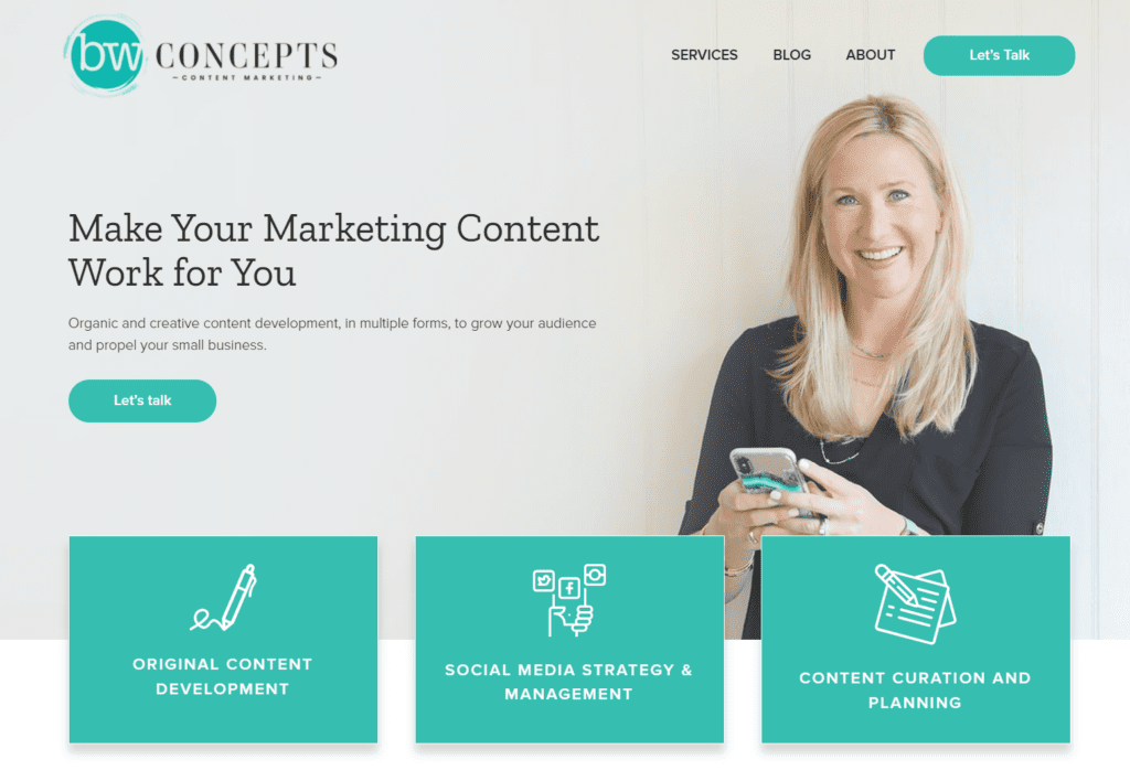
A great example of website messaging is our client, BW Concepts. The headline makes it clear that BW Concepts offers organic copy for small businesses. There are two calls to action in the first section, making it clear for visitors how to take the next step. Lastly, the site utilizes icons to further clarify the product offering.

So, Does Your Site Pass the Test?
If you’re curious if your site passes the test, schedule your complimentary 30-minute consultation and let’s talk. We can evaluate your site and discuss some of the areas that we can improve on as well.

